

File Download:
LESSON #5 : Setting Type - Typography
Common Typography Terms; Anatomy
Next up, we'll cover some of the most common typography terms for letters. Familiarize yourself with these terms to get a better handle on typography.
What Is the Baseline?

The invisible line letters rest on.
What Is the Stem?

A single vertical stroke upwards to create letters like L or F. Connect one stem to another using a crossbar detail, like the letter H.
What Are the Ascender and Descender?
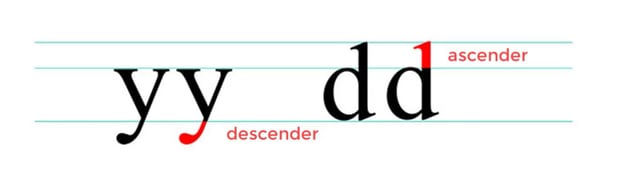
Letters with downward strokes that extend past the baseline have Descender strokes. Alternatively, if the stroke moves upward and away from the main body of the letter, we call that the Ascender stroke. That's what we mean when we talk about the ascender in typography.
What Are Uppercase and Lowercase Letters?

Uppercase letters are capital letters. Lowercase letters are smaller ones. Use uppercase letters for names and places, and lowercase letters for casual settings and more readability.
What Is the X-Height?

For lowercase letters, the X-height is the main body of the letter.
What Are the Counters and Spine?

Fully or partially closed spaces found in letters like O, A, and B. If the letter isn't fully closed, then it's an Open Counter.
What Are the Ear and the Shoulder?

An Ear is a decorative detail that pokes out from letters like g. A Shoulder is a bumped curve seen in letters like m and n.
What Is the Difference Between Serif and Sans Serif?

Serif types feature extended stroke details also known as feet. These details are missing in sans serif styles.
Units of Measure
It’s best to use points as a unit of measure when doing page layout since type is measured in points. This gives you one common measuring system.

How Bleeds Work

This is how bleeds work. Either to the margin or to the bleed line. Nothing in between.
If any artwork on the page is going to touch the edge of the page, we need to extend it to the bleed line. Bleeds are always 1/8” or 0.125”. Be precise.
Document Setup
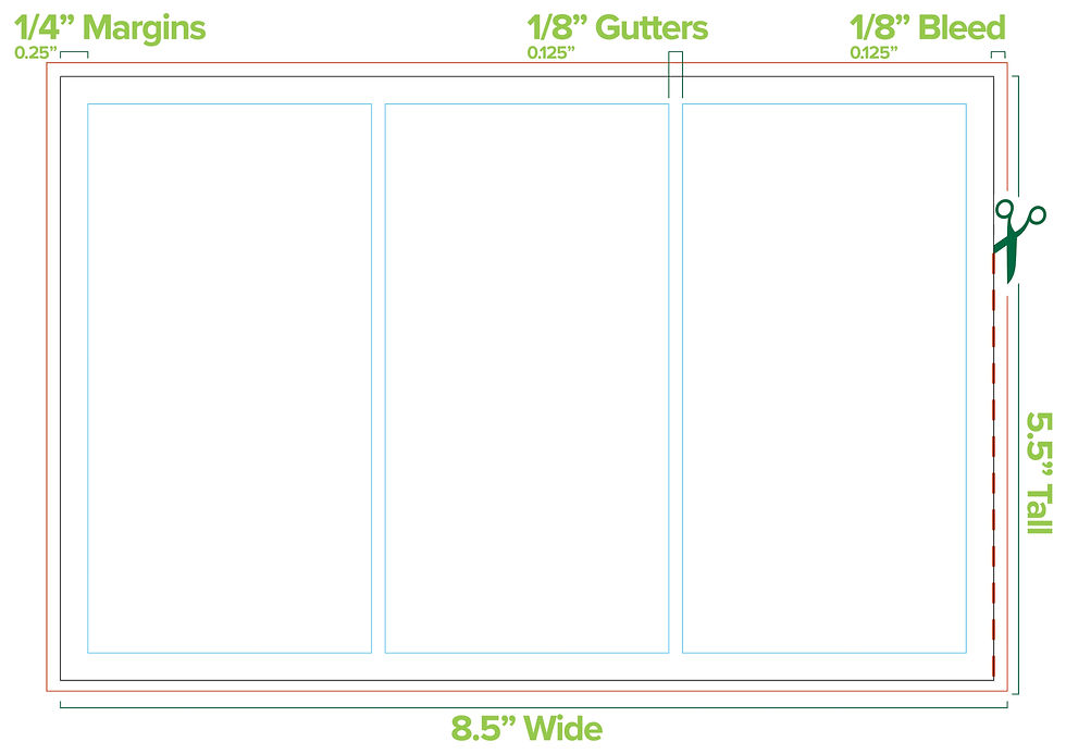
These are the dimensions for your document.
The document is half a letter page horizontally. There are three columns that have 1/8” gutters. The margins are a quarter inch all around. InDesign can do all this for you. In Illustrator, we draw our grid with stroked boxes, then convert them to guides.
For your introduction to type in Illustrator, we’ll set the type for a half-letter sized advertisement for Adobe Illustrator in Adobe Illustrator. Pretty meta, eh? We’ll use this layout to discover how to set point type and area type. We’ll put text in columns. The appearance of the text will be controlled with Paragraph Styles.
Draw out a square the size of the Artboard
Go to Object>Path>Offset Path.
put in -.25in
Make sure the Square is Selected
Go to Object>Path>Split into Grid
from here we have options to create our grids with rows columns and gutters.
We are going to make it the same sizes as above.
3 Columns with .125" Gutters
When Finished with the new boxes selected Go to View>Guides>Make Guides.

We’ll use fonts you already have on your computer. They’re part of the Myriad Variable Concept Condensed.
Paragraph Styles
Paragraph Styles store the appearance of block-level text so that appearance can be applied to various instances of text throughout your document. If the attributes of a paragraph style is edited, all the text with that paragraph style applied will change. This is very convenient when you have a lot of text to format. Edits can be done globally with only a few clicks.
Use the guide above to create on paragraph style for each different text formatting definition.
Lets Chat About the Midterm Quickly
I want to see knowledge and understanding of tools.
I want to see a variety of tools used.
You propose your own project and we create a rubric to fit the needs of the class.
Use this site below to get some ideas. You're welcome to use project prompts from this site, choose 3 projects if this is the route you want to go.
Formative Activity
Open the provided Illustrator file, then copy & paste each block of text as either point type or area type as is appropriate. Make sure all the text has a paragraph style attached.

We’ll use fonts you already have on your computer. They’re part of the Acumin Variable Concept Wide.
Resource posts
Type Videos:
SVG and Icons
https://atlasicons.vectopus.com/ | https://glyphs.fyi/ | https://healthicons.org/ | https://iconmonstr.com/ | https://openmoji.org/ | https://phosphoricons.com/ | https://simpleicons.org/ | https://www.svgrepo.com/ | https://thenounproject.com/ |
Vector Logos
Photography
General Stock Photos
https://unsplash.com/ | https://folkert.link/ | https://stockup.sitebuilderreport.com/ | https://stocksnap.io/ | https://startupstockphotos.com/ | https://www.splitshire.com/ | https://skuawk.com/ | https://pixabay.com/ | https://www.pexels.com/ | https://picography.co/ | https://picjumbo.com/ | https://negativespace.co/ | https://images.nasa.gov/ | https://nappy.co/ | https://focastock.com/ | https://magdeleine.co/browse/ | https://littlevisuals.co/ | https://librestock.com/ | https://jaymantri.com/ | https://isorepublic.com/ | https://www.imcreator.com/ | https://uhdwallpapers.org/ | https://www.growthtext.com/free-stock-photos/ | https://gratisography.com/ | https://www.everypixel.com/ | https://deathtothestockphoto.com/ | https://wordpress.org/openverse/?referrer=creativecommons.org |
Food
Vintage Stock
Patterns & Textures
Other Resources
https://www.freepik.com/ | https://freedesignresources.net/ | https://color.adobe.com/create/color-wheel
Games for Designers
https://color.method.ac/ | https://pixact.ly/ | https://bezier.method.ac/ | http://www.typeconnection.com/step1.php |
Comentarios